Over time companies need to modernize their brand. Often this comes with an overhaul of their ad campaigns, public presentation, and logo.
Since the launch of Discord, the social chat and text app has gone through a couple of different logos to stay visually marketable to the gamers and social users that frequent the app worldwide.
In this article, we will cover the entire journey the Discord logo has taken over the years, from the first development idea to the well-known design we see today.
What Was the Original Logo Design for Discord?
The Discord logo is somewhat of a mascot for the app. The smiling face that accompanies the Discord name is called Clyde, the official name given by the developers.
2015 – The Original Discord Logo
Discord Symbols and Logo Shape
The 2015 logo features Clyde inside a shape resembling a chat or “dialogue cloud” we may be familiar with from our phone text messages or online messenger apps. The logo also has the Discord name in a light blue hue all set on a white background.
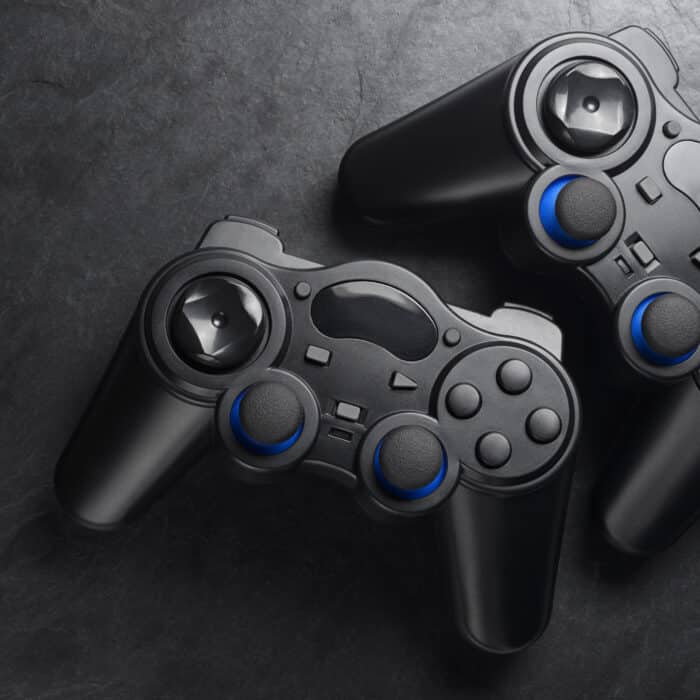
The original look for Clyde resembles a game controller. The “joysticks” were made to look like two eyes, the “triggers” to be antennae, and the “handles” being Clyde’s arms.
Clyde’s design being close to a game controller would make sense, as the Discord team originally developed the app as a chat client for gamers.
To the right of Clyde is the Discord old logo name in Uni Sans Heavy, a blocky upper case lettering. Part of the “D” on both ends of Discord has been cut off to create a more distinct appearance.
When Did Discord Change Their Logo Design?
In 2021 Discord updated their logo, changing basically all the graphic elements of its design. While the smiling mascot emblem and Discord trademark name remained consistent, Discord changed the general appearance of the logo. Making sure to keep the design similar enough that users would still recognize it.
2021 – Discord New Logo
Discord Symbols and Logo Shape
Discord’s new logo features the mascot trademark Clyde next to the Discord name, spelled out in a custom-style Ginto Nord font.
Both Clyde and “Discord” are all-white on a purple/blue-hued background.
Old Discord Logo vs New – What Are the Differences?
While the new and old logos share some common traits, the logo designs are very different in both presentation of Clyde and the logo font.
The logo dropped the dialogue cloud and has the entire logo in white on a purple/blue background.
The main changes are the design of the mascot logo and the font.
-
Clyde
Clyde has been redesigned to be a simpler sleeker version of the original. Losing the antennae for a boxier top shape, and reduced space between the main portion and the arms.
Many users didn’t like the redesign, as they had come to really like Clyde’s defining features like the antennae and trademark smile.
-
Discord Logo Typography
The Discord name brand design has dropped the Uni Sans Heavy all upper case look for a new font, the softer lower case custom Ginto Nord.
-
Discord Logo Hues
The original Discord logo was colored in a light blue, but in 2021 the developers changed the color to the now recognizable purple and blue. This blue/purple has been dubbed “Blurple” by the Discord devs.